Letus
Brand identity · Digital
PRIVATE INVESTMENT
Finance, with a
personal point of view.
A brand identity and digital presence for a private office serving ultra-high-net-worth individuals.
- My role
- Brand platform, visual identity, graphic design and digital design.
- Scope
- Brand identity · Digital
A quieter kind of confidence.
Context & challenge
A private office serves people, not just portfolios. The identity had to express the discretion of private finance while giving Letus a more personal, recognisable presence.
Strategic response
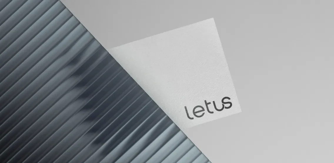
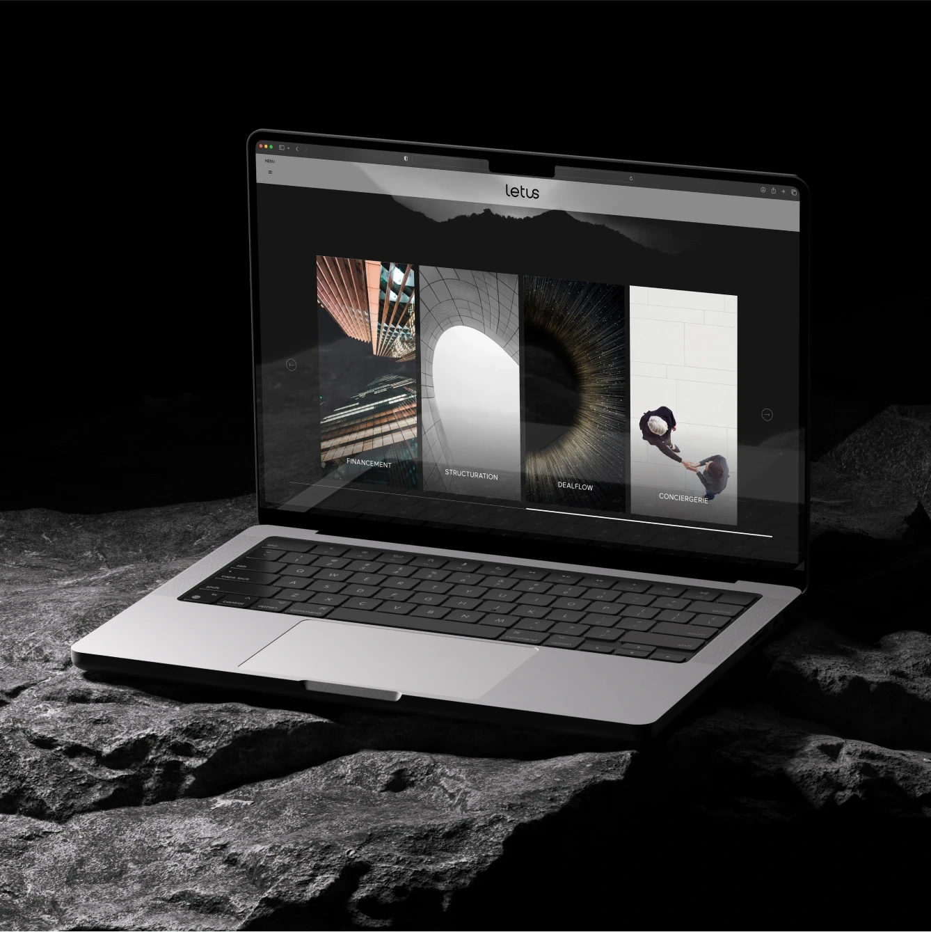
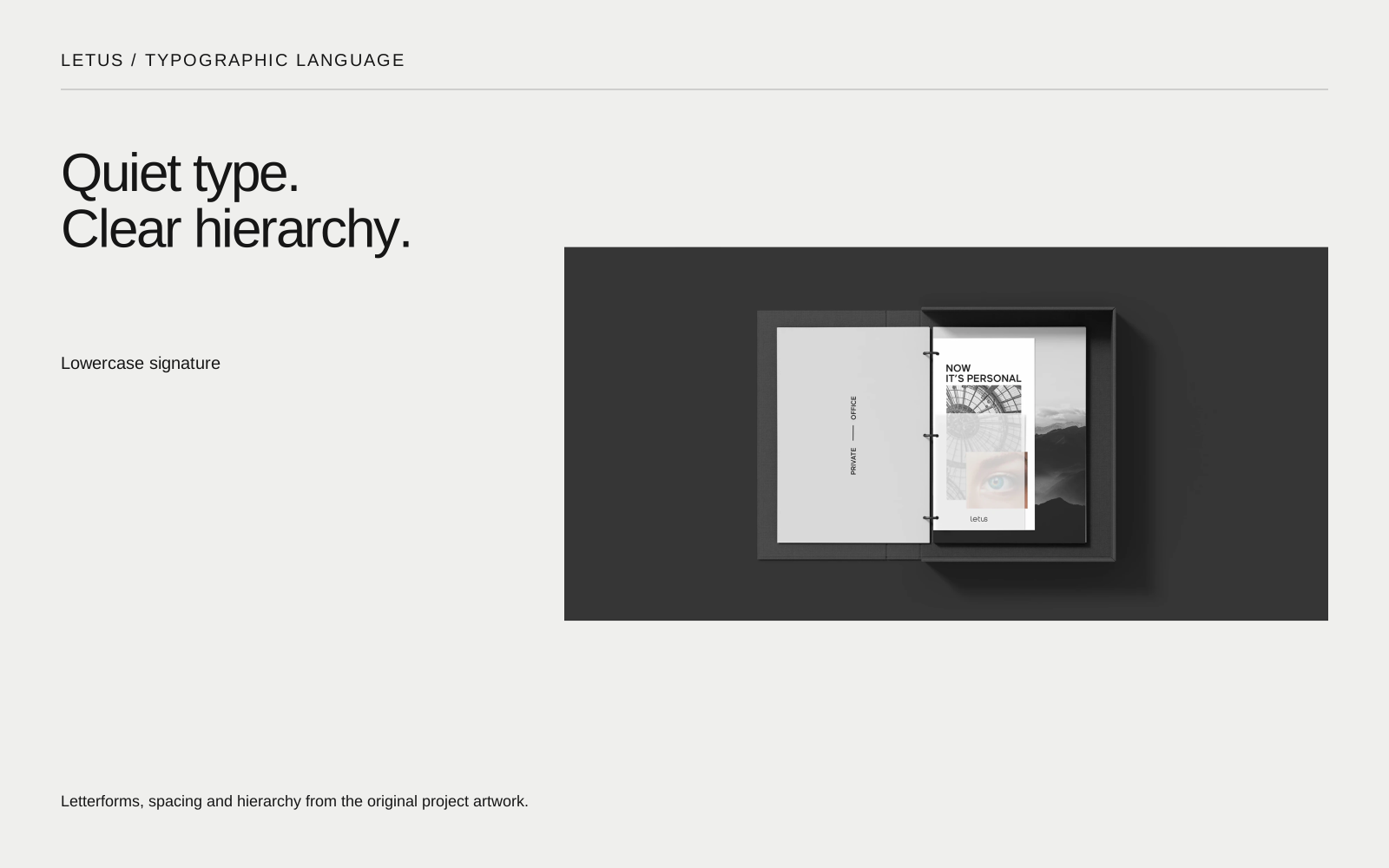
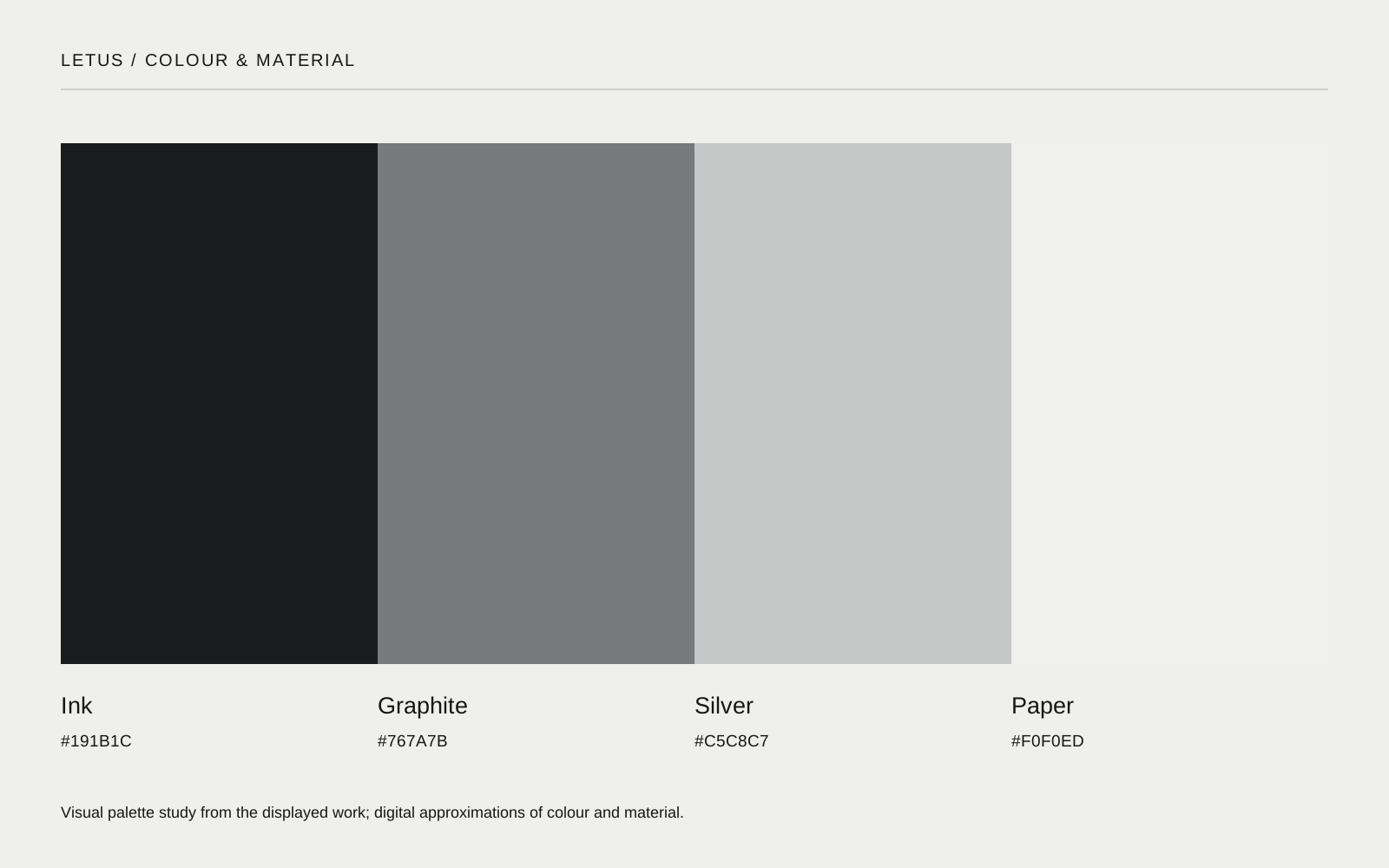
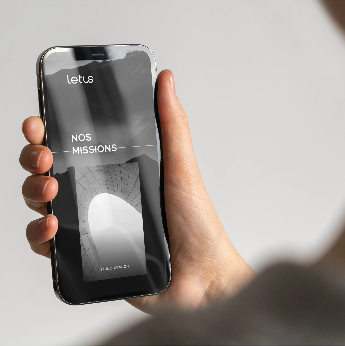
The work brings a lowercase signature, a monochrome foundation and architectural imagery into one visual language. Across the website and printed materials, generous space lets a small number of elements carry the identity.
Quiet type.
Clear hierarchy.
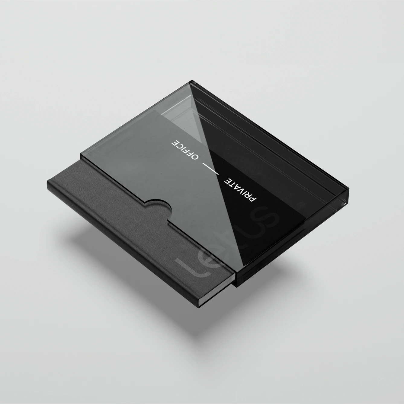
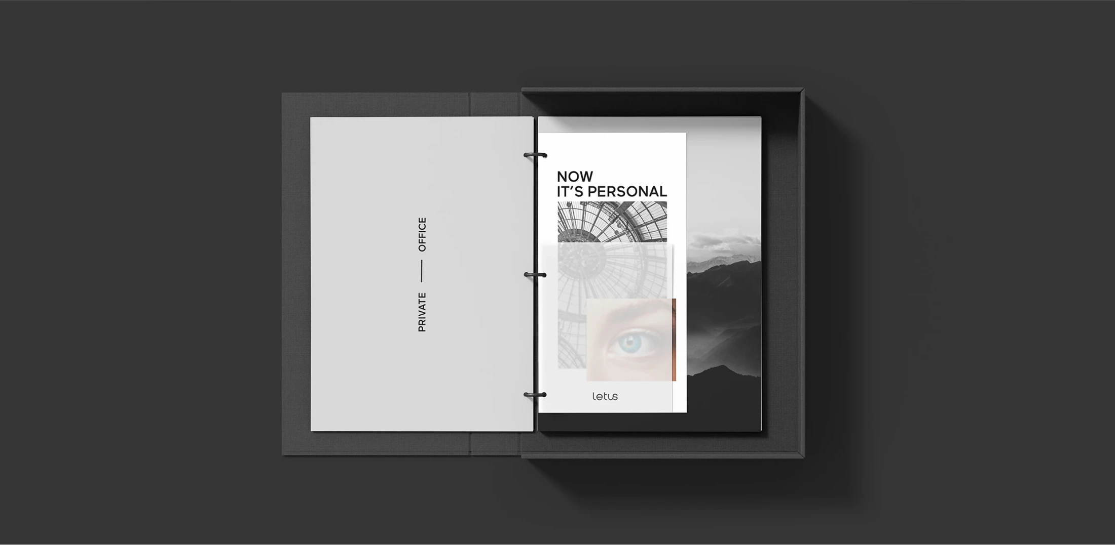
The identity works through restraint: the wordmark stays readable, imagery adds depth, and clear changes of scale establish hierarchy. The same contrast between quiet surfaces and strong editorial moments connects the website, documents and signage.
 View full size ↗
 View full size ↗
From the private office to the screen.
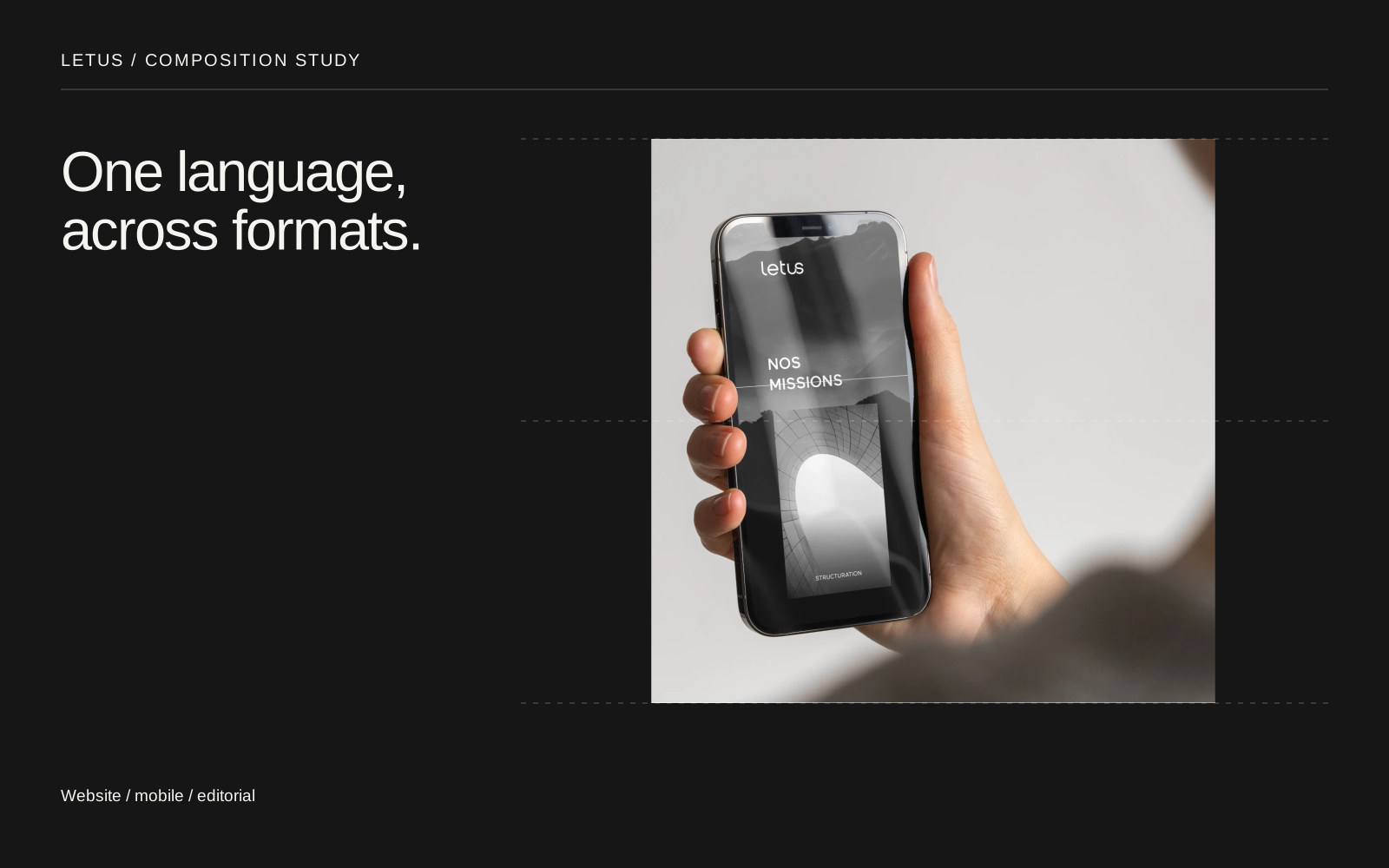
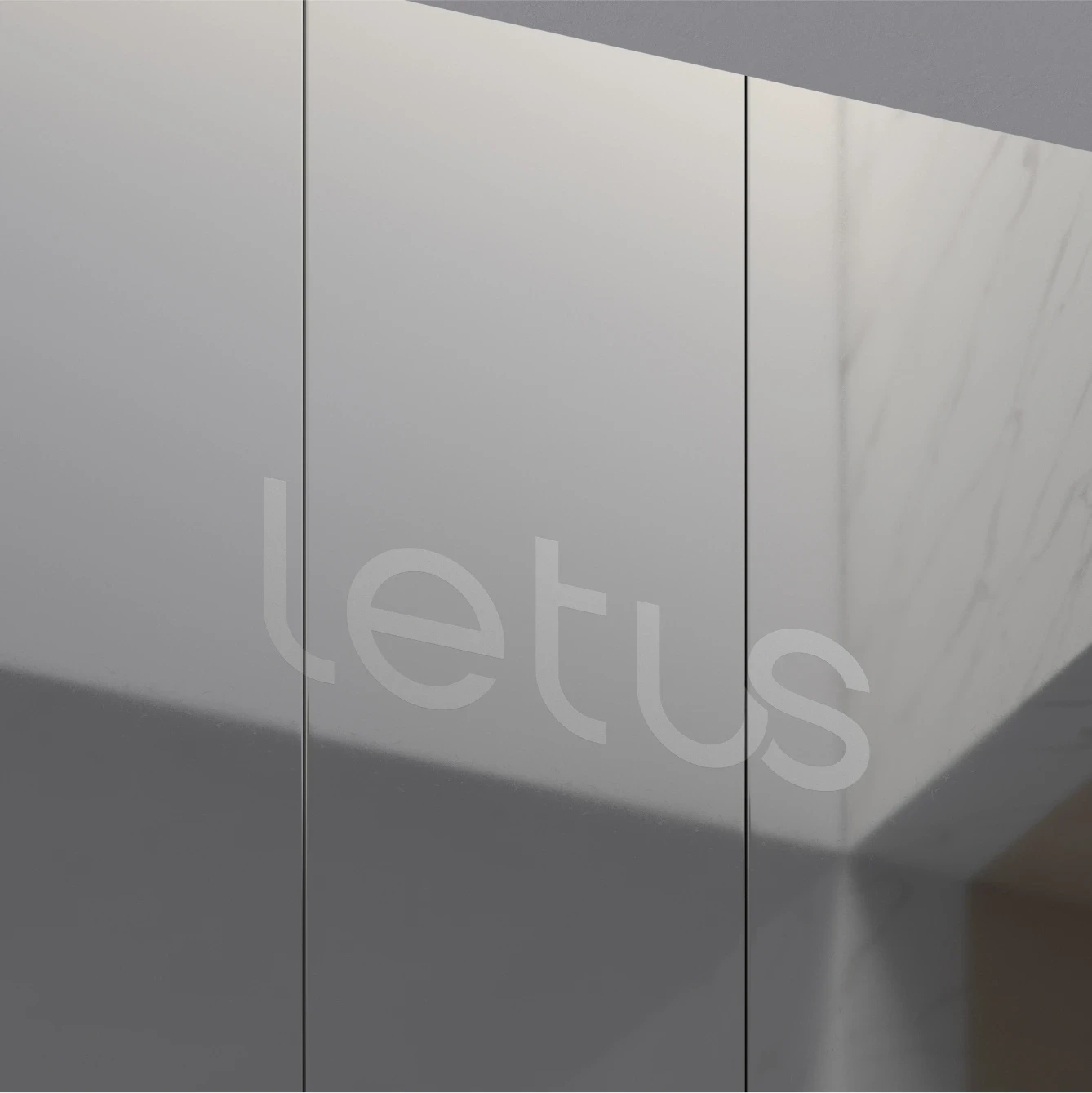
Printed documents, architectural signage and a responsive website make the identity tangible at different scales. The digital layouts carry the same balance of image, type and negative space.
Project credits
- Design & creative direction
- Mikael Semhoun
- Agency
- Blackmotion
- Client
- Letus