Innvesta
Brand identity · Art direction
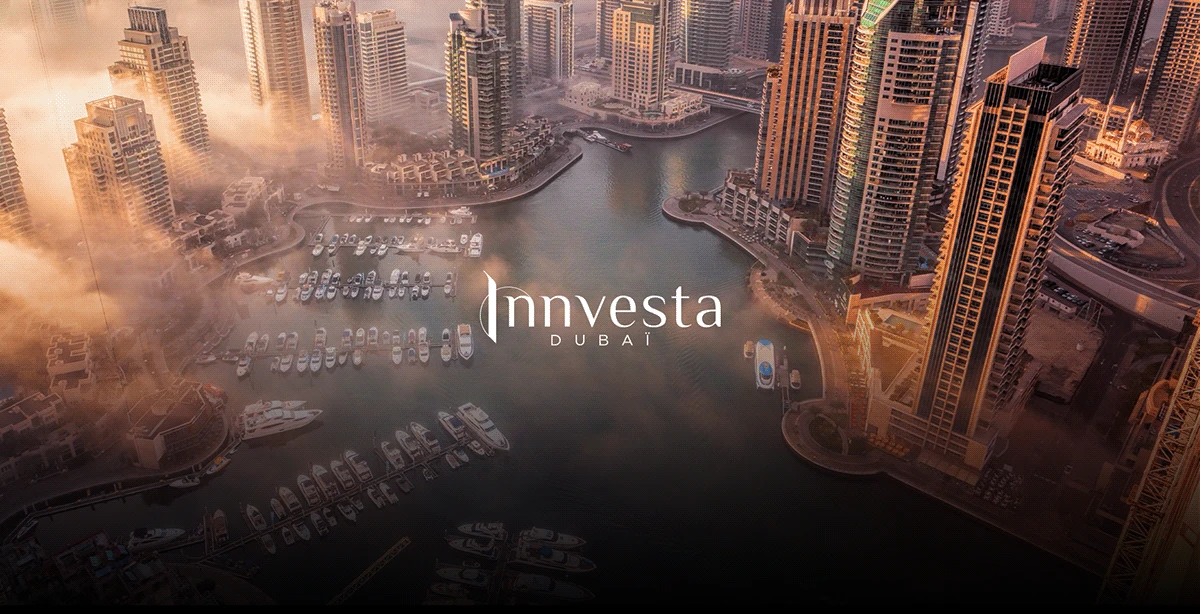
REAL ESTATE INVESTMENT · DUBAI
A sense of place.
A signal of trust.
A visual identity for a Dubai real estate investment brand, connecting architectural references with a language of trust.
- My role
- Identity concept, visual design and brand applications.
- Scope
- Brand identity · Art direction
Architecture becomes identity.
Context & challenge
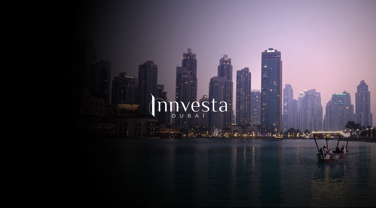
For a real estate investment brand in Dubai, place is part of the proposition. The visual identity needed a connection to the city and a consistent expression across investor-facing materials.
Strategic response
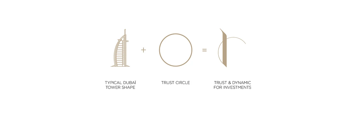
The symbol combines the profile of a Dubai tower with a circle associated with trust. The result links the business to its environment, with a distinctive mark that can stand on its own or sit alongside the wordmark.
Architectural mark.
Editorial signature.
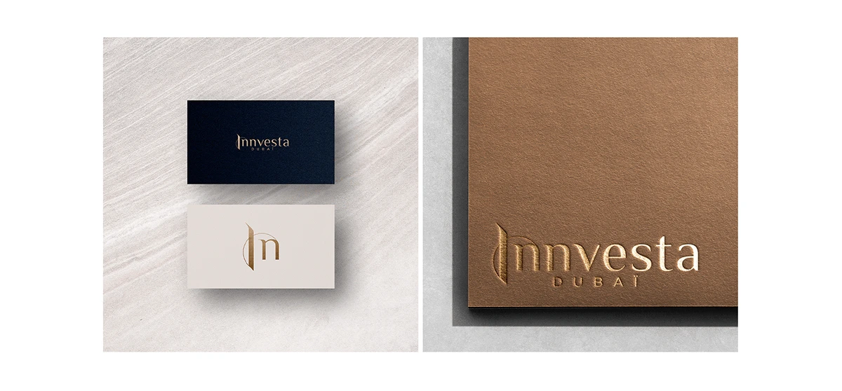
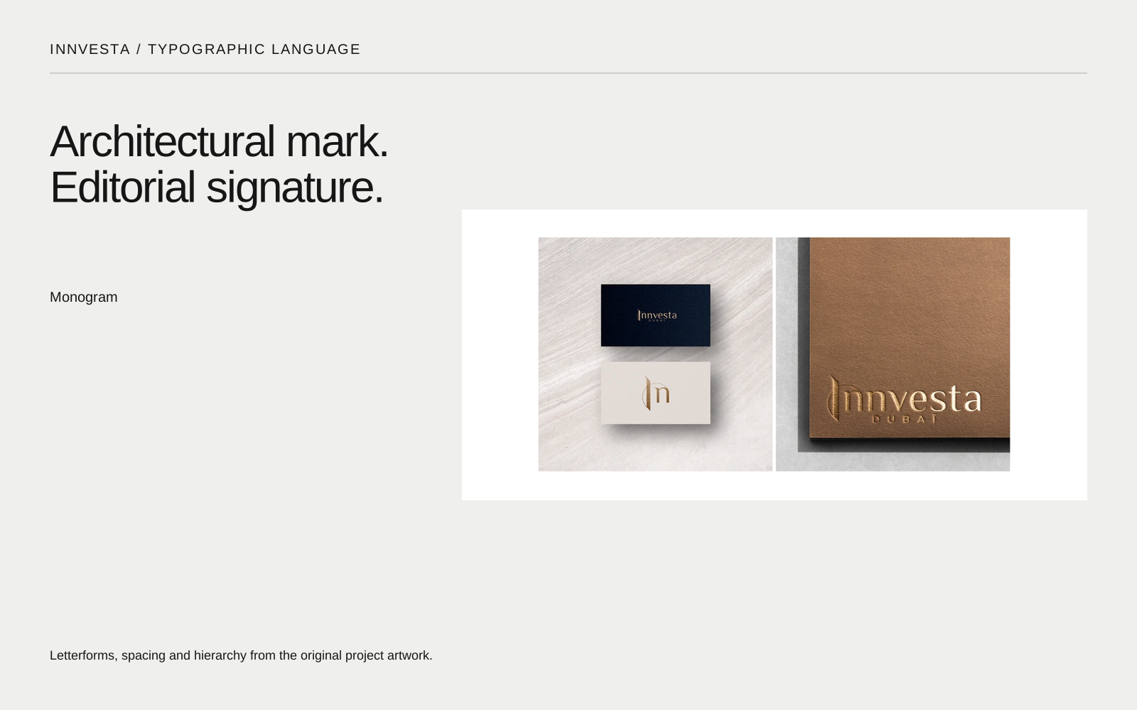
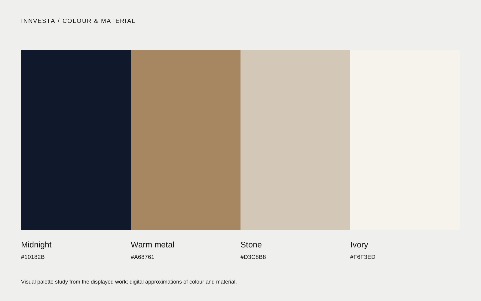
A serif signature brings contrast to the architectural symbol. Dark grounds, light paper and warm metallic finishes connect the stationery to the city photography. The identity moves between a compact monogram and a wider, more atmospheric expression.
 View full size ↗
 View full size ↗
A signature that holds
across every touchpoint.
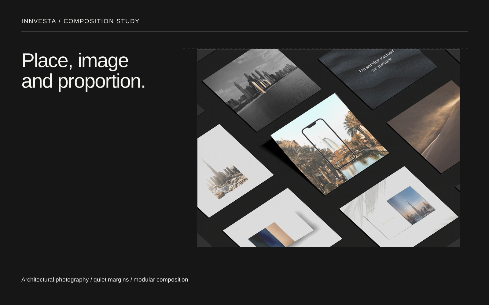
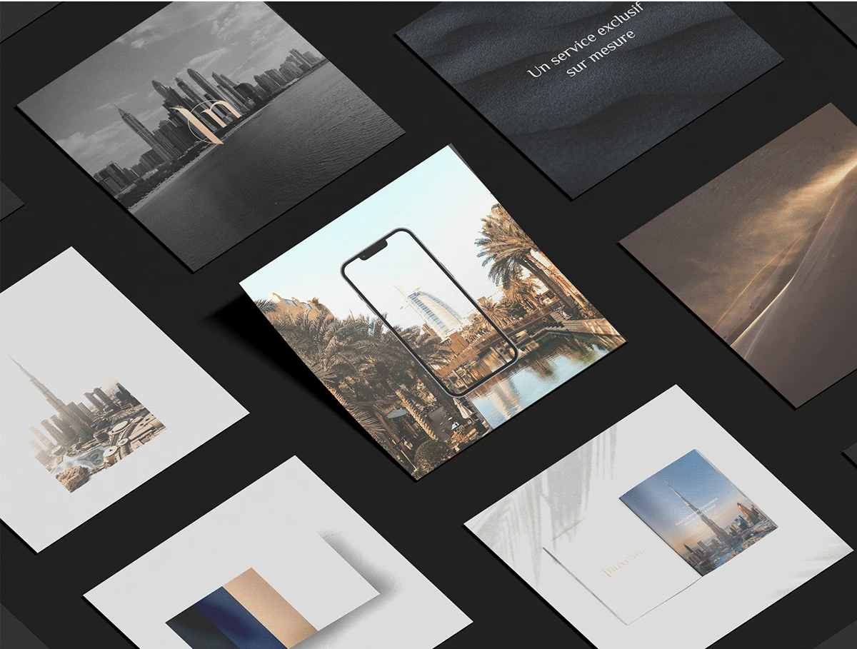
The identity appears in stationery, presentation layouts and photographic brand compositions. Close-up applications show how the mark behaves at a smaller scale; the wider compositions connect it back to Dubai.
Project credits
- Identity & art direction
- Mikael Semhoun
- Agency
- Blackmotion
- Client
- Innvesta